House Tour- Guest Bedroom
/The guest room started like this….
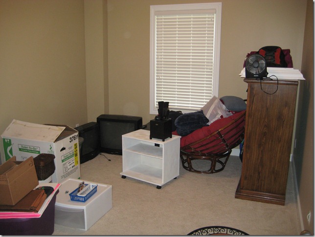
and it stayed liked that for about a year and half. Oops!
We’ve slowly added stuff to the room and it currently looks like this…
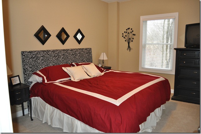
It just doesn’t look like I want it to…luckily we haven’t had to spend a lot of money in here.
(I had to post the before picture so you can at least see that we're making progress.)
What don't I like?
- I think the flowers are going to find a new home (after I made Nate put a screw in the wall to hold them…oops!)
- The comforter looks messy…always. It was the comforter we used in our master in our first house and I was happy to trade it in. So, I think I’m on the look out for another one in here. I’m thinking plain old white with a black bedskirt.
- And that hunking tv……Nate and I are still battling over that tv. Our compromise may be moving a smaller one from my sewing room in here.
- And I’m not digging the wall color in this room. I like it in our living room but not here.
- And….
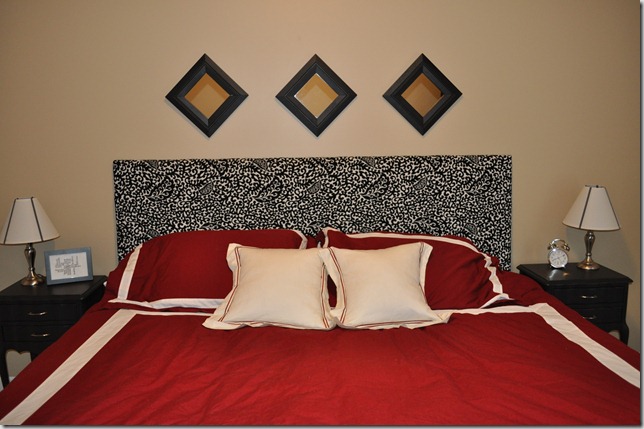
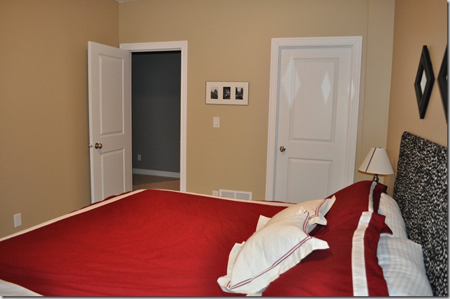
I plan on adding a “gallery wall” of frames on the left wall.
Room info:
Wall color: Sherwin Williams Macademia
Headboard: Made it! (read about it here)
End tables: Salvation Army (read about them here )
Dresser: Hand me down (read about it here)
Mirrors: Salvation Army (read about them here)
Lamps: Target
Bedding: Fieldcrest something (Target) (We received it as a wedding gift.)
Wall Flowers: Pier 1 (gift)
Anything else: Ask!
What are your thoughts?
- on bedding...love it? hate it? suggestions?
- If you have been my guest/plan to be a guest….do you think the tv is important or is it just a giant eye sore? Don’t worry, you won’t hurt my feelings...maybe Nate's..but not mine.

