Blogging Basics- Static Pages
/Do you all remember when I wasn’t a flaky blogger? Yeah, me neither.
Back in the day (or 2 months ago) I started this series called “Blogging Basics.” I covered such topics as to blog or not to blog, making a blog header, finding your niche, and using social media. Today I’m bringing it back. Why? Because I like to be helpful. (And the only house projects I completed this past week-end were cleaning and folding underwear. Neither of which are worthy of a blog post. Or are they.)
Today I would like to discuss static pages. Let’s make this a group effort. Feel free to chime in.
Overall, content is the most important part of your blog. Layout is right up there though. Everyone and their dog (literally) is writing a blog these days. Readers need to be able to navigate your blog easily. You may have completed an amazing room reveal two months ago but as a first time visitor, I am probably not going to take the time to read back through two months of posts. I read somewhere that readers should be able to find what they are looking for on your blog with two clicks. Two clicks.
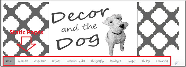
One way to make your blog easier to navigate is the addition of static pages.
Static pages are pages that don’t change. Hence the static. Man, this stuff is rocket science.
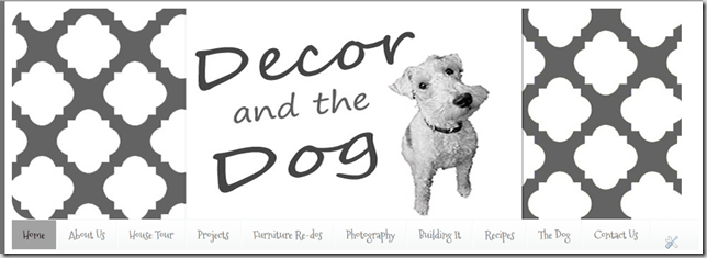
If you have a lovely house tour page, I am easily able to view that amazing room reveal that you posted two months ago. Boo-yah. I am suckered into your blog and will add you to my Google Reader.
How do you create static pages? I will show you in Blogger. Because I no speak the Word Press.
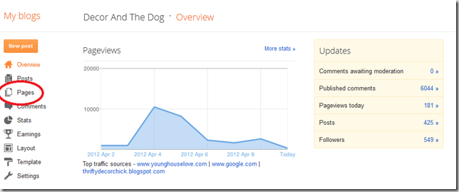
1. Go to your dashboard. A private blogger would make a fake blog to show you this stuff. I, however, am an oversharing/lazy blogger.
Can you tell when Young House Love posted my powder room? Poor little baby blog didn’t know what hit it. Focus.
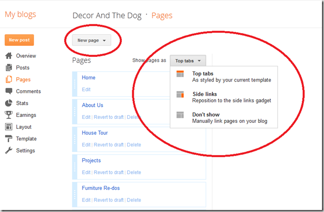
2. From here you have the option to add a new page. You can also determine the location of your static pages from this screen. I currently use the “top tabs” option. I’ve seen both options work well.
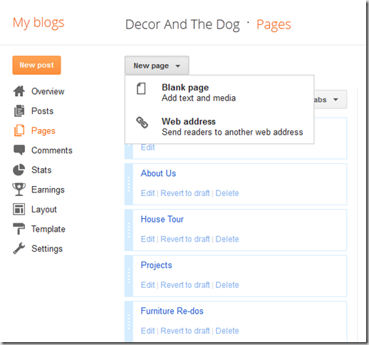
3. When you click “New page” at the top of the screen, you will be given two options. We will choose “Blank Page.”
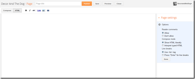
4. You will be taken to a screen that looks very similar to your regular posts. Add your page information and hit “publish”.
What kind of pages should you add? Any kind! I would strongly recommend an “About Me” and “Contact Me” tab. One of the first pages I like to read of a new blog is the “About Me.” The “Contact Me” may seem unimportant for a new blogger. At least that’s what I thought. Little did I know, people really did want to contact me.
5. Pat yourself on the back and enjoy those pretty tabs/static pages!
6. Stop patting yourself on the back. Keep up on those tabs. This is where I shamefully tell you all that my tabs need a lot of work. The shame.
What are your thoughts on layout? Static pages? The two click theory. What layout features sucker you into a new blog? What should we discuss next week?

