How to Decorate Bookshelves
/Alternate Title: Bookshelf Styling for Dummies by a Dummy
I debated even writing this post. I don't consider styling one of my life strengths. Napping, yes. Dog snuggling, yes. Repainting every room in my house, yes. Styling no.
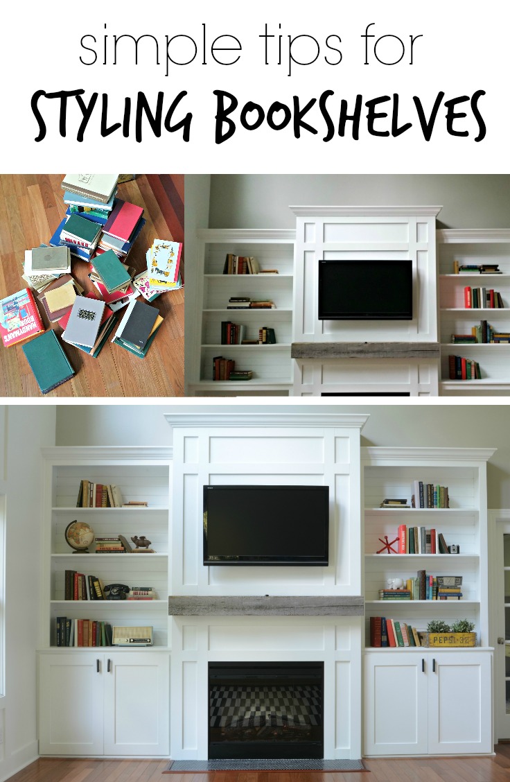
I am, however, happy with how the styling on our living room built-ins turned out. I mentioned previously that I still plan to add more books but I think this is the max amount of knick-knacks these shelves will see. I'm in the camp that bookshelves should hold mainly books. There is a "bookshelves full of things" camp too. I'll let you decide how you want to spend your Summer. No judgement on this end.
Ike is all about the books. Can't you tell?
I'm going to explain the steps I took to throw things onto these bookshelves. Did I say "throw things"? I meant style. Yes, style.
Nate and I took careful consideration when building these shelves to make sure the scale was right for the room. The room is large. Therefore the bookshelves are large. Therefore I had a ton of space that needed filled. And I was on my own. Turns out Nate's help stops at building. I wish he'd help out around here. Rude.
Step 1: Gather Your Items
I started by gathering all of the items in my house that I thought would work. I had a pile of books and a pile of tchotchkes (photo missing). Nate and I had been picking up things that would potentially look good on the bookshelves throughout our travels this Summer. All of our tchotchkes are thrifted/vintage except for the red jack (from Hobby Lobby). I wasn't sure if I was going to use all of the items but it was nice having a pile of things to choose from.
From what I read on the interwebs, the decorating Gods want you to have a cohesive color scheme. My cohesive color scheme was ALL OF THE COLORS. Well, most of them. I mainly had old books to work with and most of them have a brownish, bluish, greenish look. I threw in some red because I like red. So, I'm already sort of failing at step one. Go team Decor and the Dog.
Step 2: Start With The Books
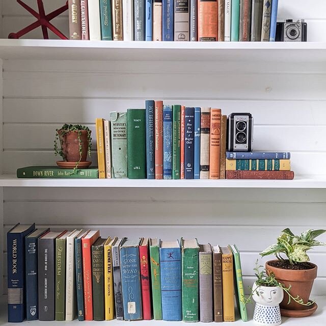
I placed an equalish (technical styling term) amount of books on each shelf. *insert something smart about balance* I arranged them to look like they are non-nonchalantly placed on the shelves and not expertly styled like they were. *insert hysterical laughter*
Step 3. Fill In With The Tchotchkes
I then grabbed some tchotchkes and filled in the holes left by a lack of books. (Totally waiting for that 50 cent book sale at the library.)
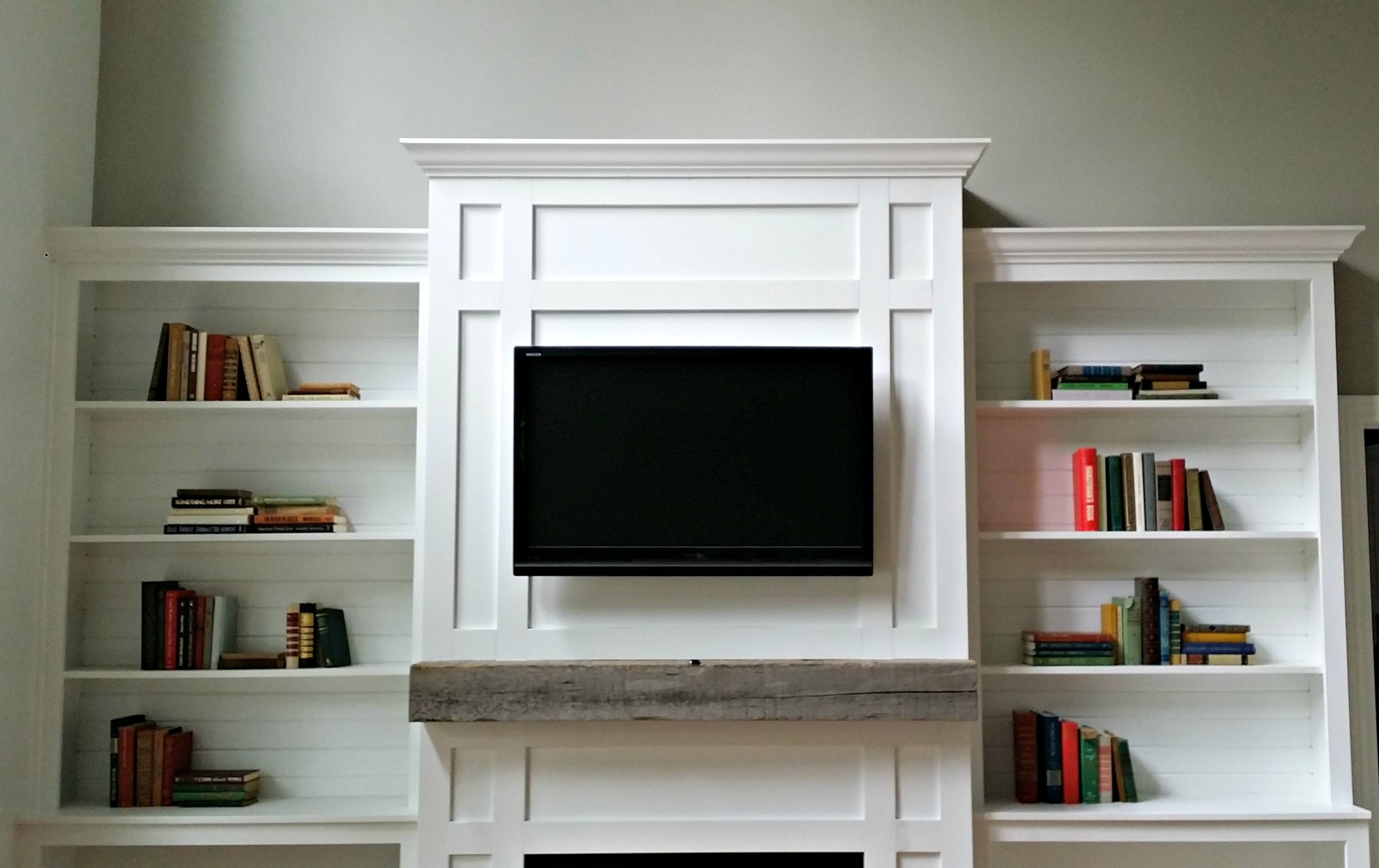
Attempt one was actually one of my better first attempts at this styling stuff. Unfortunately, the bottom right just wasn't doing it for me. It just didn't feel right to me. It was like that corner was dragging down the rest of the shelves. Tip: Take photos during the process. It's sometimes easier to judge balance from a photo.
Step 4: Edit
Let's move a few things around.
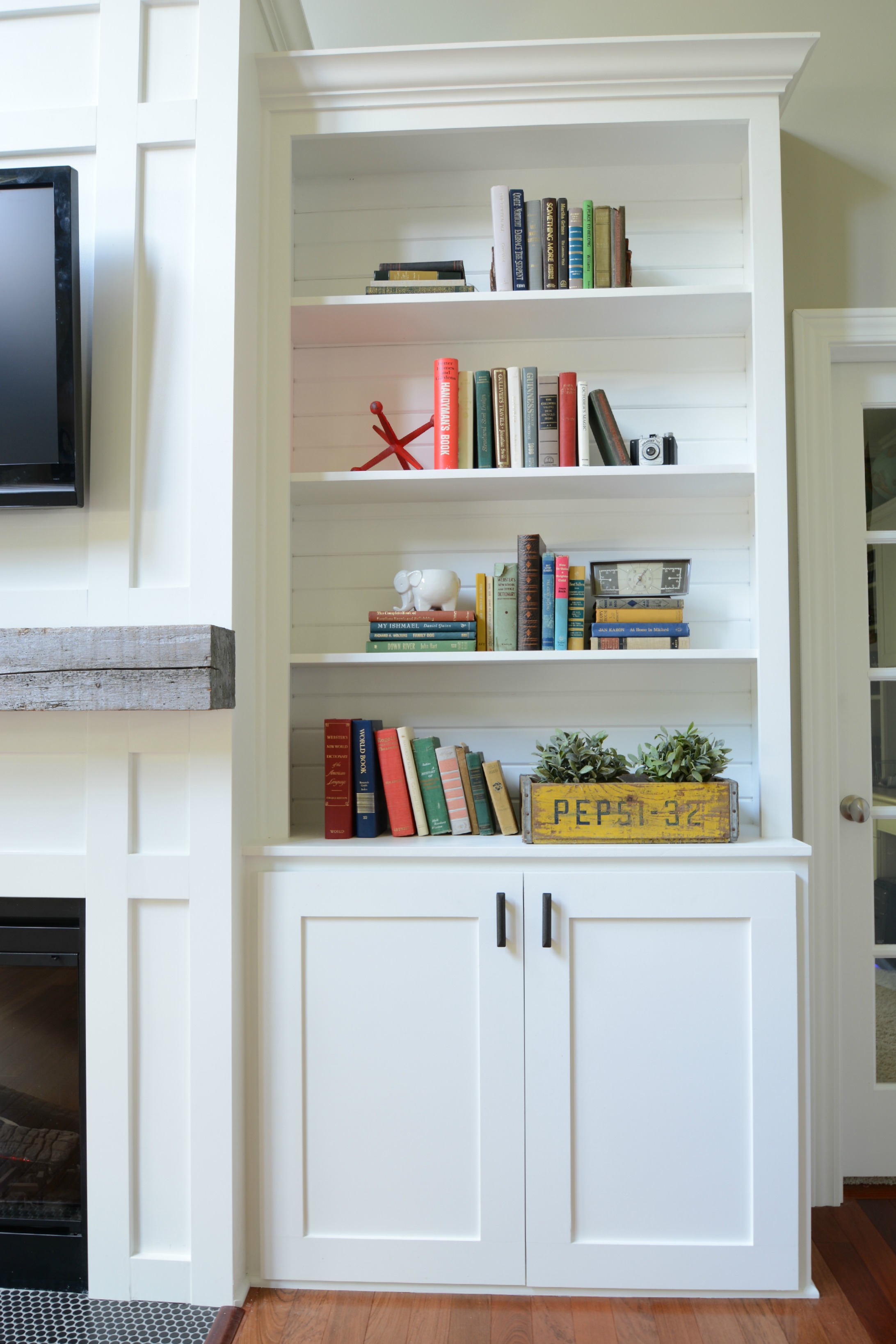
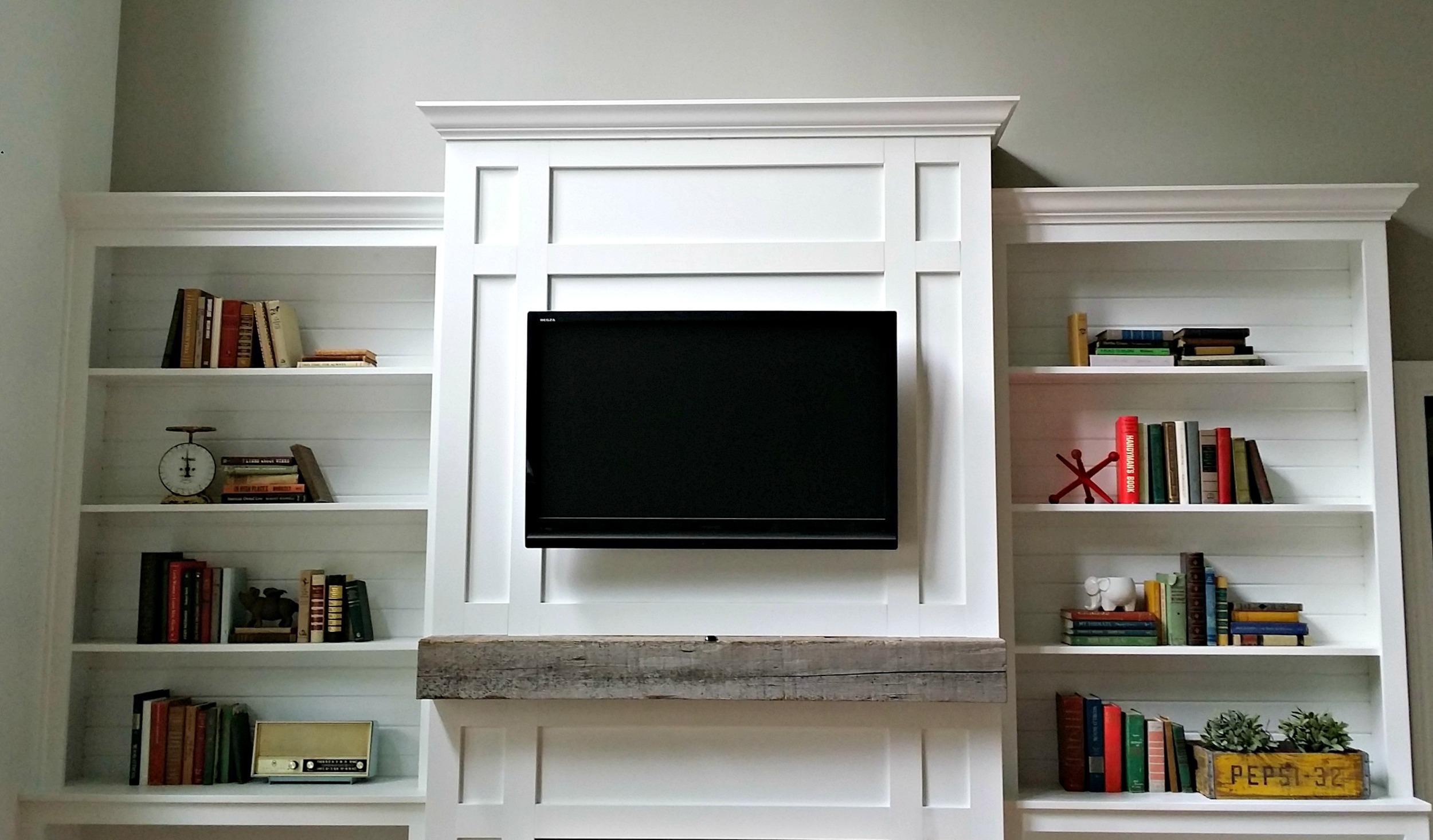
I brought in the vintage Pepsi crate (because I needed that mustard color in my life). I filled it with some fake Ikea plants to bring some life to the space. (Oh, the irony of adding fake plants for "life".)
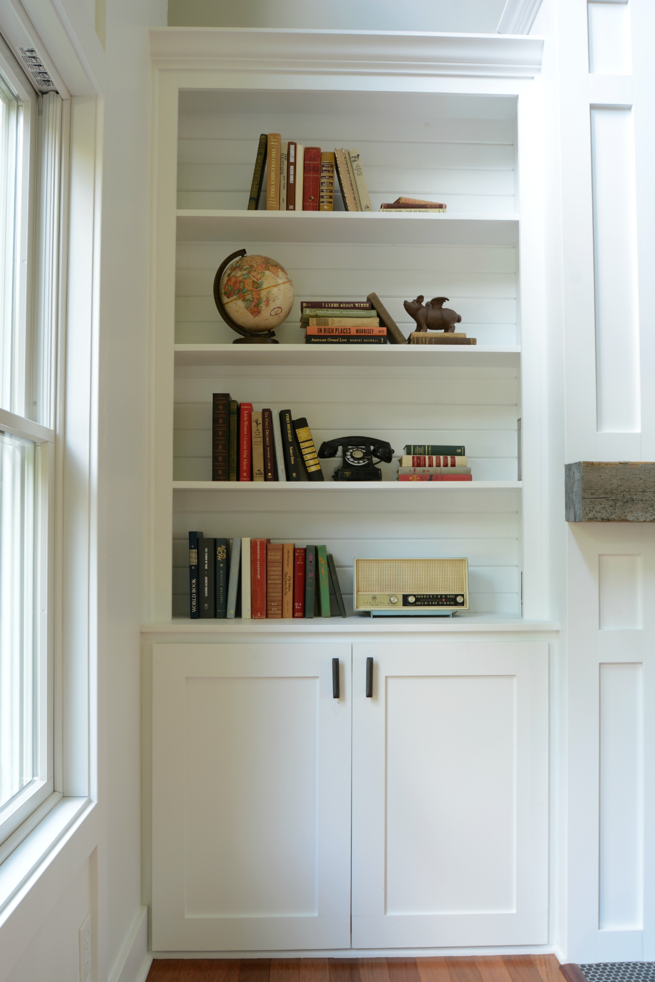
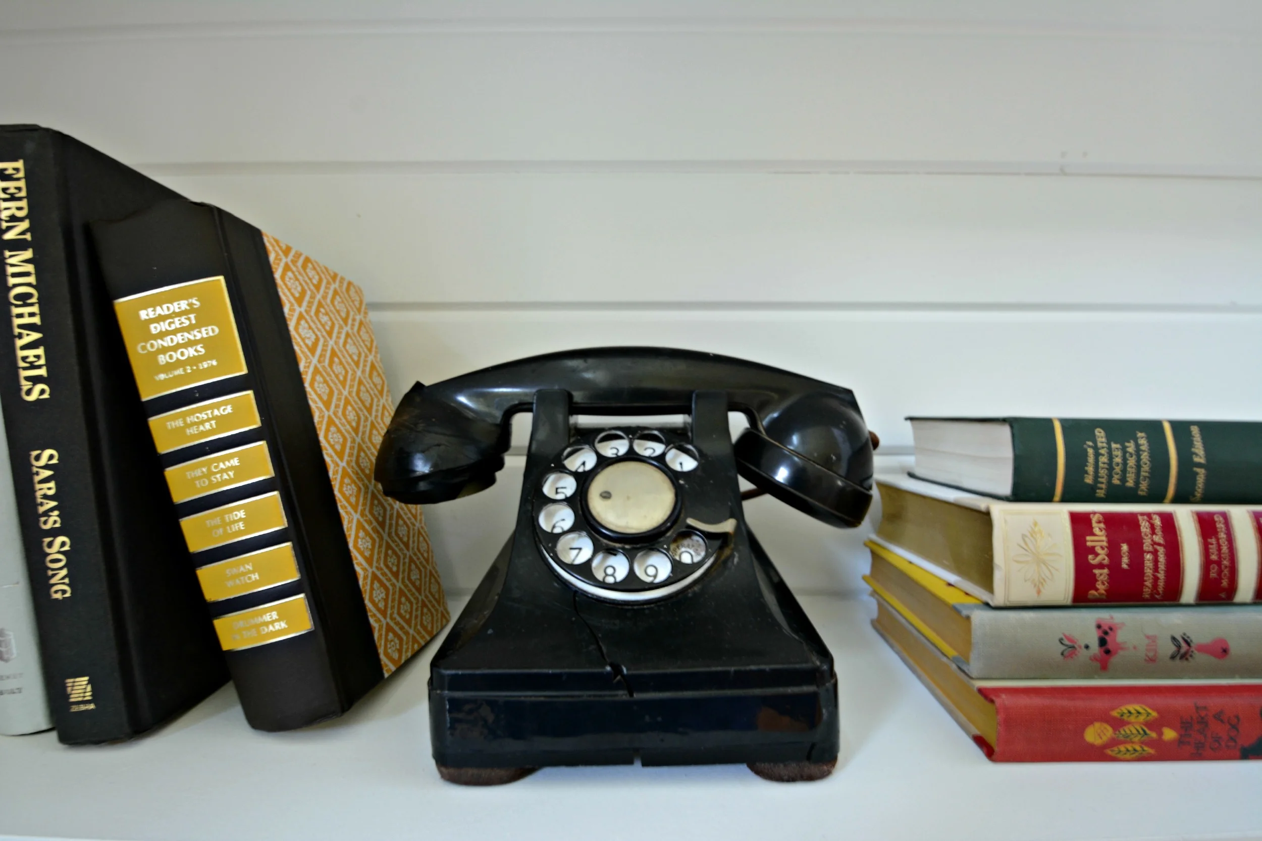
Now the second shelf from the top on the left was bothering me. It seemed lonely and sad. I also had a vintage black phone that I wanted to mix in.
We're getting closer (I promise) but now the second shelf from the top on the right seemed unbalanced. I grabbed a vintage camera from my stash of tchotchkes and shoved it (placed delicately) in place. Also, that second shelf on the left still wasn't making me happy. I swapped the scale for a globe.
Step 5: Pat Yourself on the Back
Give yourself a big ol' high-five and wait for that book sale. And keep adding things that you pick up at antique stores. Oops.
I had also read that shelves should sort of resemble a triangle when properly styled. I can kind of see it in mine. The bottom is heavier and slims out at the top. Nailed it. Unintentionally.


